Sticks and Stones BBC 3 TV Trailer Final Cut:
To start off production of my TV trailer I first created my script as I this would allow me to get my ideas onto the page and then organise them into a chronological order that would make sense:
Once I had finished writing my script I then began creation of my storyboard, working through my script turning to make a visual representation of what I wanted production to look like:
After I had completed my script and storyboard and then started choosing my actors for production which meant I also collected the consent form for these two actors as seen in the image below which would allow me to use their image in my production without any legal issues:
Before I could begin filming I first had to conduct a risk assessment in order to assess the hazards that may be present when filming my TV trailer, I also had to crease a call sheet which would be passed to the actors so that they know where and when they need to be on set for:
Risk Assessment:
Call Sheet:
Once I had finished the pre-production for my TV Trailer I began production which started off with filming using an iPhone 7 which I turned the exposure down on in order to give more shadow to the video so it had great depth. When filming I did not use a tripod and hand held my phone as this gave my footage a more real feeling which would be obtained if it was a real documentary where the camera would just be over on one of the crews shoulders which would have some natural movement to it. At first I was working with two actors in a classroom setting as seen below:

However during filming I realised that I was not happy with the mise-en-scene in this shot as I didn't feel like it the lighting was right as it seemed quite dark and I didn't think it portrayed a light and comedic atmosphere. I also wasn't happy with the props in the room as I thought it felt crowded due to lots of leading lines in the shot. Unfortunately I wasn't happy with the acting during this time either as it seemed very stiff, which was my fault as the actors were not proper actors and I gave them the script before which they followed very strictly, which meant the acting seemed quite robotic almost.
After re-evaluating my first shoot I decided to change a few things, I changed the actors that I used mainly due to actor confidence in-front of the camera and also due to actor availability in order to meet the product deadline. I also changed how I briefed the actors before filming, instead of giving them the entire script I gave them the context of the filming an character relationship, the required movement of their characters and the key talking points as I thought this would allow the actors to improvise a little to fill the gaps but would also make it come across as more natural. The next change I made was to change the setting of filming so to do this I chose a filming time which allowed me to use a different classroom in the school which was more appropriate for the mise-en-scene I wanted to achieve as shown below:

I was happier with this composition and the actors I used as I thought they suited the roles better and the dynamic they had together worked very well and appeared more natural. The setting and composition of this shot seemed more open which I thought conveyed more honesty to the audience which is what I wanted as the genre of my TV series is a mockumentary so it is important the audience believes it is real, as I was using different actors I also then had to gain talent content forms for these actors so that I can use their image in my production:
Once I had finished collecting my footage I began editing this using Final Cut Pro, to do this I first had to import to footage I collected form my iPhone 7 to my Mac in order to access the footage on final cut. The footage I needed to import was just one video as it was all one shot, as both the hardware devices I used were Apple this allowed me to export the video from my phone over airdrop in order to import it onto my laptop, to begin editing.
To begin editing my footage I first had to organise my files on Final Cut Pro creating a new library on my computer labeled "Unit 20 Components", and then creating a new project within that library labels "Unit 20 TV Trailer V1" making sure that the dimensions and the resolution I was editing at would be suitable standard for broadcasting on social media or on TV:

Once I had created this base on Final Cut Pro I began editing by first importing my footage onto the timeline which gave me the base to began the full editing process:

The first thing I did was to detach the audio from the main clip as there was some dialogue I wanted to trim out of the visual footage without effecting what is seen on screen, also at this stage I added a fade in visual effect at the start of my clip just to make the start of my trailer come onto screen easier:

Once I had added the initial fade in I then imported the BBC Three ident over the top of my clip, I then resized the logo reducing its size by approximately 72%, and moved it to the top left of the screen and reduced the opacity to 40%. I reduced the size so that it did not take up the whole screen but can still be easily viewed / noticed by the audience so they know who produced the TV show and have an idea of where they can watch the full show if they liked the trailer. I chose the top left of the screen to place the ident as I've seen this format in other BBC 3 trailers such as "This Country" but also it would catch the audiences attention as Leo Thomas moves out of shot to the left during the scene which would draw the audiences attention to the left, therefore viewing the BBC Three Ident. I reduced the opacity of the ident just so it didn't distract the audience from the action taking place in the scene as deducing the opacity would make it stand out less however I only reduced it to 40% so that it still could be seen. I also added in a "fade in" effect to the BBC 3 Logo in sync with he fade in effect of the video footage so both elements came onto screen together:

After I had added the BBC Three ident on-top of my timeline I could begin cutting my footage in order to isolate the parts which I wanted to remove the audio from. The audio I was removing is when I directly talk to the actors which was caught on film as the characters in my TV Trailer have a relationship with the camera so to make this seem more natural I answered the questions they asked in order to make the timing gap more real and their expression afterwards to be believable. To do this I isolated the times when I was talking to the actors:

Once I had isolated these clips I detached the audio from them and deleted the times when I was talking, however this meant there was no sound in these clips which didn't fit with the light amount of background static noise in the previous clips. To solve this detached the audio of other clips where there was no dialogue audio and copied this then placed it beneath the clips in order to mask the silence with the background noise from the alternate clip:

This is what my timeline looks like after the editing so far:

After I had sorted out the audio for the start of my footage I also had to do the same for a segment at the end of my footage as this was also a point in my production where the actors interact with the camera and I respond back to the actor so it seems more fluid, so I just replicated what I did in the earlier segment of my footage in order remove my own voice and fill it with the same background noise I had used before.

Once I had sorted out editing my voice out I had finished the main base of my TV trailer so the next step was to begin adding in the extra assets I had created or downloaded. To begin with I added in my TV series narration to the end of my trailer and reducing the sound of the audio from the footage. I only reduced the sound of the original footage and did not remove it completely as I wanted to keep some natural audio in beneath the narration just to keep the on screen action and sound more real. To record the narration I sent off the sub-section of the script that I needed the voice actor to record as this would save them time over reading the entire script and identifying which dialogue they needed to record. The actor then recorded the audio and sent back to me via email as an mp3 file which allowed me to easily import this to Final Cut Pro in order to add it to my timeline. Below is the consent form for the voice actor and how my timeline on Final Cut Pro looked after I added in the narration:
Voice Actor Talent Consent Form:
How the updated time on Final Cut Pro looks:

Once I had completed and was happy with how the diegetic and non-diegetic sound ran throughout my TV trailer I began working on how the trailer would finish, this primarily included adding a fade to black on both the BBC Three Ident and my video footage so I used the built in "fade to black" effect within Final Cut Pro to do this. I made sure that both fade effects were synchronised in timing so that the TV trailer would finish at the same time and both elements would fade in sync so that it appears more uniform.

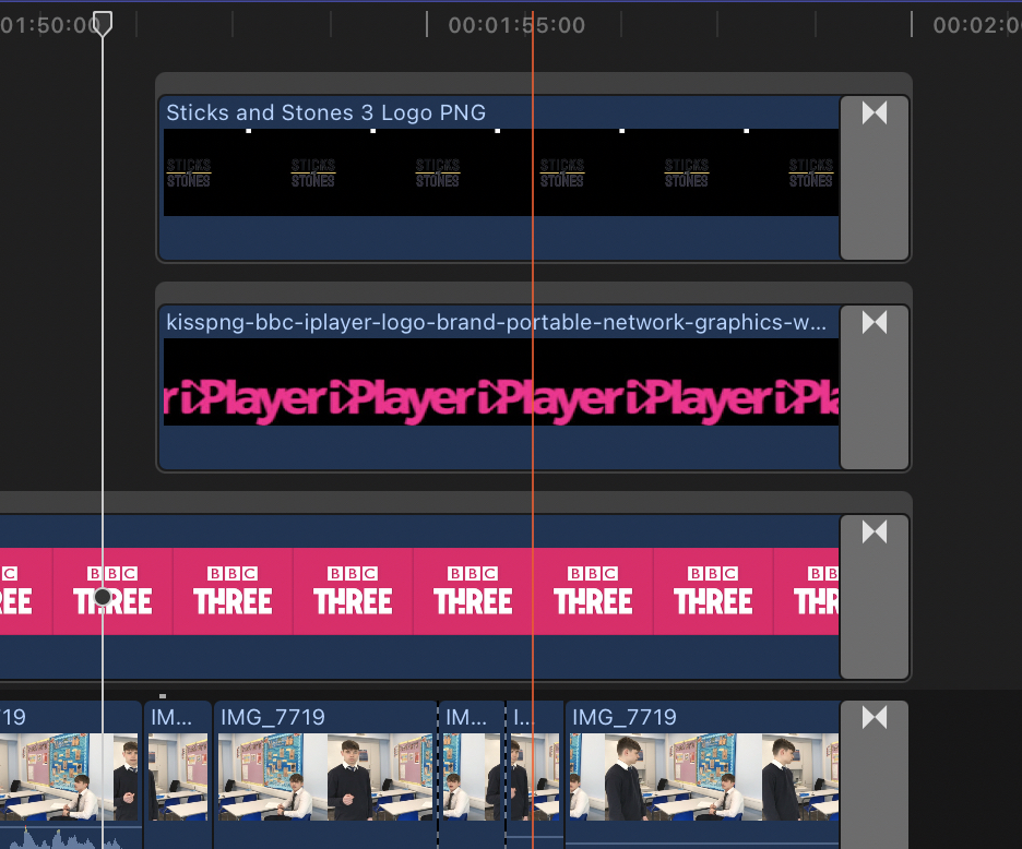
The final thing I needed to add to my TV trailer was my own ident for Sticks and Stones so that it was clear to the audience what the program was called and also would increase the exposure of my TV series's ident which ultimately would become an important part of brand recognition for my TV series. I also needed to include the BBC iPlayer ident so it was clear to the audience where they could watch my TV series. I placed both of these assets above the footage on my main timeline so that they would be in the foreground of my TV trailer, and aligned them to appear as the narration begins as this would give the audience both visual and audio prompts at the same time of where, when and how they can watch my TV series.

Both of the idents I imported as png files so that there was no white background that would've taken away from the design of the asset itself. I also resized these assets so that they were complementary to each other, placing the Sticks and Stones ident just above the centre of the screen with the BBC iPlayer ident beneath it. I did this because the title of the TV show is the most important information that needs to be passed onto the audience as if they were determined to watch my TV series they could find out where it is being aired from just the title. I added in the BBC iPlayer ident beneath this as it is secondary information but for maximum consumer retention its important I make it as easy as possible for the audience to find and watch my TV series.

The final thing after I had resizing my assets, is to make them come onto screen and leave screen smoothly so to do this I used a built in "fade in" effect on Final Cut Pro to make the graphics fade onto screen, which I timed alongside the start of the narration so both visual and audio promotion happened at the same time. Then in order to make the graphics fade of screen I used the built in effect "fade to colour" in Final Cut Pro and chose to fade to black, and synced both of these graphics to fade to black at the same time as my BBC Three ident and my visual footage so all elements finished at the same time:
Once I had finished editing and was happy with my TV trailer I thought about colour correcting some the footage in order to make it more vibrant however I didn't do this as the genre of my TV series is a mockumentary so having vibrant colours may give the impression of a high production value and take away from the illusion that the action is real. I also made sure that the sound balance was below -6bd and ran at 48kHz as this is industry standard so if the audio within my tailer was above this value it would not be aired. My TV trailer also had to run at 25 fps with the initial quality being 1920 x1080.

Once I had completed these checks to ensure my TV trailer was broadcast standard, I then began the process of exporting my TV trailer from Final Cut Pro into two different final formats, an Apple Pro Res 422 format and a H262 file format. I had to export my final trailer as these two different files as they come with different properties, the Apple Pro Res 422 format creates a high quality QuickTime movie file which takes up more storage which is the file I will give to the client as its essential they get the highest quality possible. The H262 file still creates a QuickTime movie file however its lower quality as it is used for uploading to social media and Youtube so that it uploads quickly and also plays back quicker in order to keep the clients interest retention higher when they click on any promotional media products.

Creating my Ident -
To begin creating my ident that is used in my TV series I first did some blue-sky thinking in terms of initial ident idea drafts which involved sitting down with a blank piece of paper and drawing any ideas for ident designs that come to mind with no limits or restrictions:

After finishing my blue-sky thinking I spent a while looking at the designs I had created and tried to visualise what they would look like if they were digitalised which helped to eliminate the designs I didn't think would be suitable for my TV series. I removed the designs based on a few factors, first off if I thought it was too complicated to be easily recreated across the whole media campaign such as number 13. The next factor I used to eliminate some designs was that if I could find an appropriate font, I did this by using "Dafont" to search through fonts which helped eliminate designs 1,2,3,4 and 12 as I didn't like any fonts that would be complementary of these designs.
I then began to look at the genre of my TV series which was a drama mockumentary, this meant that the conventions for my ident should be aligned with that of a normal documentary. The conventions of a documentary ident typically lent towards being bold and easy to read as the important thing was the content of the documentary rather than how visually appealing it is, therefore I eliminated designs 6, 7, 8 and 9 as I didn't think these met the conventions. This meant that I was left with just deigns 5, 10 and 11 however I eliminated design 10 and I thought it might come across as childish if I had images in the title as this was not the impression I wanted to convey onto my audience. This left me with just design 5 and 11 however I began thinking about how my ident would be used in promotional products such as posters which allowed me to choose design 11 over 5 as design 11 was more square so it would not interfere as much with the layout on other promotional products.
After I had chosen which design I was going to invest my time into creating digitally I first created the skeletal design on pages, as at the time I was creating this we were not able to come into school which meant I did not have access to software such as Adobe photoshop and illustrator:

This was just the basic design of my ident, with the text and shapes in the correct sizing and the correct layout which I was happy with, I then began choosing the colour scheme that I would use, this needed to be bold and dark colours in order to stand out on bright backgrounds. I then used an online colour scheme website "https://coolors.co" which allowed me to view a range of different colours side by side to help choose what colours I would use. The first colour I used was yellow for the separating line as I thought this created contrast between the dark text:

I then used the website "https://coolors.co" again to find contrasting colours against this yellow colour as I dissent want the text to be black so was looking for a dark greys or blues in order to contrast against this yellow, which lead me to my final ident design:


No comments:
Post a Comment